
 By admin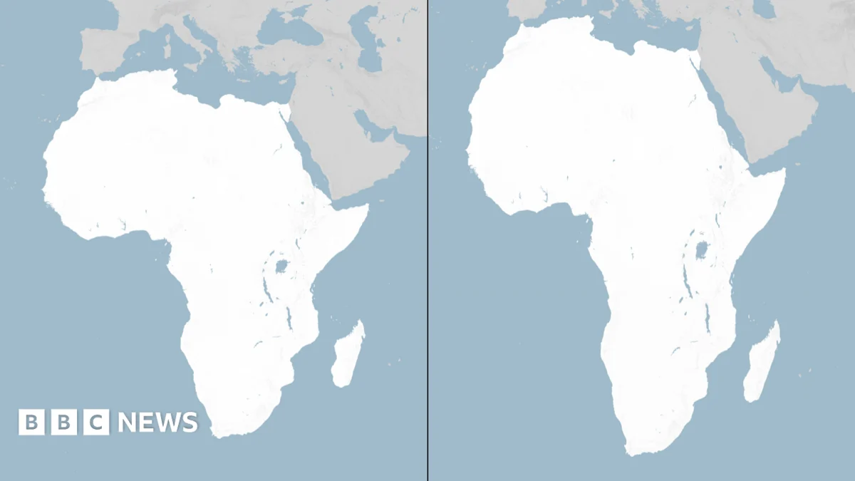
The year is 1569. In a world teetering on the precipice of global exploration and burgeoning empires, a Flemish cartographer named Gerardus Mercator unveiled a revolutionary tool: the Mercator map. Designed with the explicit purpose of aiding European navigators in their ambitious voyages across uncharted oceans, this projection became an indispensable companion to the age of discovery. Its ingenious grid system, where lines of longitude and latitude intersect at right angles, allowed sailors to plot courses of constant bearing, known as rhumb lines, with unprecedented ease. This seemingly simple innovation was a game-changer, facilitating the expansion of trade routes, the charting of new territories, and the very conception of a connected world. For centuries, the Mercator map reigned supreme, its familiar rectangular shape becoming synonymous with the planet itself. However, the very brilliance that made it so useful for navigation also contained a fundamental flaw, a compromise inherent in the cartographer’s Sisyphean task of rendering a spherical Earth onto a flat surface.
The inherent distortion of the Mercator map is a direct consequence of the insurmountable challenge of accurately representing the curved surface of a globe on a two-dimensional chart. Every map projection involves a degree of compromise, a sacrifice of one geometric property to preserve another. Mercator’s projection, in its pursuit of navigational utility, chose to preserve angles and shapes, particularly along the equator. To achieve this, it systematically stretched areas as they moved away from the equator towards the poles. This means that countries and landmasses closer to the equator appear smaller than their actual size, while those nearer the poles are significantly exaggerated. For instance, Greenland, a vast island in the Arctic, appears on a Mercator map to be roughly the same size as Africa, the largest continent on Earth. In reality, Africa is approximately 14 times larger than Greenland. Similarly, Canada, sprawling across the northern hemisphere, appears disproportionately vast compared to its actual landmass. This distortion, while a boon for maritime navigation, has had profound and lasting implications for how continents and nations are perceived, subtly shaping global understanding and influencing geopolitical perspectives.
This subtle yet pervasive distortion, a legacy of European-centric exploration, has long been a point of contention for those who believe it perpetuates an unequal representation of the world. The visual dominance of countries in the Northern Hemisphere, particularly Europe and North America, on Mercator projections has been criticized for creating a subconscious bias, elevating their perceived importance and diminishing the true scale and significance of continents located closer to the equator, such as Africa and South America. This is not merely an academic quibble; the way we visualize our world directly influences our understanding of its geography, its resources, and its peoples. Maps are not simply neutral representations of space; they are powerful tools that shape perceptions, influence how we think about power dynamics, and inform our understanding of historical and contemporary global relationships.
In an effort to rectify these long-standing visual inequalities, a dedicated team of cartographers, driven by a commitment to greater accuracy and fairness, embarked on a mission to create a new world map. In 2018, their diligent work culminated in the unveiling of the Equal Earth projection. This innovative map is designed to be an "equal area" projection, meaning that the relative size of landmasses is preserved, regardless of their latitudinal position. The Equal Earth projection achieves this by employing a more complex mathematical formula that sacrifices the perfect preservation of angles that Mercator championed. Instead, it prioritizes the accurate representation of area, ensuring that no continent is visually diminished or inflated. The result is a map that offers a more truthful and balanced depiction of the Earth’s surface, presenting continents in their correct proportions relative to one another.
The significance of this new projection was not lost on the African Union. In February, the AU’s 54 member states formally adopted the Equal Earth projection, a momentous decision that underscores a growing awareness and a deliberate effort to correct historical cartographic biases. The adoption was accompanied by a clear statement from the AU, emphasizing that the Equal Earth projection "more accurately represents the sizes of all continents, particularly Africa." This endorsement signifies a powerful shift in how Africa views itself and how it wishes to be represented on the global stage. It is a declaration that the continent demands a visual identity that reflects its true scale and importance, free from the distortions that have historically minimized its presence.
The push for a more equitable map has found a vocal champion in Togolese Foreign Minister Robert Dussey. Ahead of a significant vote on map usage at the United Nations, Dussey articulated the core sentiment driving this movement with a powerful and resonant statement to Reuters news agency: "A fair world begins with a fair map." This simple yet profound declaration encapsulates the belief that visual representation is intrinsically linked to justice and equality. Dussey’s words highlight that the adoption of a more accurate map is not just an aesthetic preference; it is a fundamental step towards fostering a more equitable global order.
In earlier remarks at a UN briefing, Dussey further elaborated on the subjective nature of cartography, stating, "A map is never neutral. It shapes perceptions, influences how the place of peoples and continents in the world is understood." This assertion underscores the critical role that maps play in constructing our understanding of the world. They are not inert objects but active agents that mold our consciousness, influence our biases, and ultimately shape our geopolitical viewpoints. By perpetuating a distorted view of the world, Mercator’s map, despite its historical utility, has inadvertently contributed to a skewed perception of global power and importance. The adoption of the Equal Earth projection, therefore, represents a conscious effort to dismantle these ingrained visual biases and foster a more informed and equitable global perspective.
The upcoming vote at the United Nations, while non-binding, carries significant symbolic weight and is expected to catalyze widespread changes in the maps utilized by various institutions around the world. This means that from educational materials and governmental publications to international organizations and digital platforms, the shift towards the Equal Earth projection, or similar accurate representations, is likely to gain momentum. This transition is more than just a technical adjustment; it is a cultural and political statement. It signals a global recognition of the need for cartographic accuracy and a commitment to representing all nations and continents with fairness and respect. The legacy of Gerardus Mercator, a testament to human ingenuity in the service of exploration, is now being re-examined through the lens of global equity. While his map served its historical purpose, the world has evolved, and so too must our understanding and representation of it. The adoption of the Equal Earth projection by the African Union and its potential widespread adoption following the UN vote mark a pivotal moment in cartographic history, a step towards a world where a fair map truly begins to pave the way for a fairer world.
