
 By admin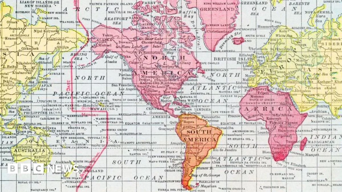
Over four and a half centuries after its inception, the Mercator map projection, a cornerstone of global cartography, continues to shape our understanding of the world, yet its inherent distortions are increasingly drawing scrutiny and sparking debate. Created in 1569 by the Flemish cartographer Gerardus Mercator, this revolutionary projection was not conceived as a neutral depiction of geography, but rather as a sophisticated navigational tool designed to empower European mariners charting the vast and often perilous oceans. The primary objective, as elucidated by Professor James Cheshire, a distinguished cartography expert at University College London, was to ensure that a straight line drawn on the map would correspond to a constant compass bearing in reality. “He wanted a straight line to be drawn on a map to look like a straight line in reality if you followed a compass bearing,” Professor Cheshire explained to the BBC. “That was what it was intended to do, and that’s what it does brilliantly well.”
To achieve this crucial navigational accuracy, Mercator ingeniously devised a system where the grid lines of latitude and longitude were systematically stretched as they moved away from the equator towards the poles. This mathematical manipulation was essential to preserve the angular relationships between locations, a critical feature for sailors relying on compass readings. However, this elegant solution came at a significant cost: spatial distortion. The Mercator projection, in its attempt to flatten the curved surface of the Earth onto a two-dimensional plane, inevitably compresses areas closer to the equator while dramatically expanding those nearer to the poles. Consequently, countries situated near the equator, such as many in Africa and South America, appear considerably smaller than their actual geographical size, whereas nations located at higher latitudes, like Greenland and Canada, are depicted as disproportionately vast.
This inherent distortion is not a flaw in Mercator’s genius, but rather an unavoidable consequence of attempting to accurately represent a spherical object on a flat surface. The mathematical impossibility of a perfect projection of a sphere onto a plane means that every projection will, to some degree, distort either area, shape, distance, or direction. The Mercator projection prioritizes direction and shape, making it exceptionally useful for navigation. However, its trade-off is a severe exaggeration of the size of landmasses as they approach the poles.
Despite these well-documented distortions, the Mercator projection’s influence has endured with remarkable tenacity. For over 450 years, it has remained the bedrock of many of the maps we encounter daily. From the familiar atlases in school classrooms and the geopolitical representations on television news broadcasts to the ubiquitous digital maps that guide our journeys, including the immensely popular Google Maps, the Mercator projection continues to be the default visualization for much of the world. Its widespread adoption is a testament to its historical significance and its practical utility for a generation accustomed to its visual language.
However, in contemporary discourse, the Mercator projection is facing increasingly vocal criticism, particularly concerning its psychological and geopolitical implications. Critics argue that the visual hierarchy it imposes, where some regions appear minuscule and others gargantuan, can subtly influence our perception of their importance and significance. The ingrained human tendency to associate larger objects with greater importance can lead to a subconscious devaluation of countries that are visually downplayed by the projection. This perceived distortion can have profound real-world consequences, particularly in shaping international perceptions and economic narratives.
Kenyan geographer Kioko Muendo, a vocal critic of the Mercator projection, has articulated how this cartographic bias has implicitly diminished the perceived scale of Africa’s immense natural resources, its burgeoning population, and its significant investment opportunities. For Muendo and many others, maps are far more than mere navigational aids; they are powerful instruments that actively shape political and economic discourse on a global scale. “Maps are more than just guides for travellers – they shape how regions are perceived politically and economically,” he emphasized to the BBC. This perspective highlights a critical disconnect between the purely functional design of the Mercator projection and its unintended, yet potent, socio-political ramifications.
The impact of this distortion can be observed in various spheres. In international development, the visual underrepresentation of African nations might contribute to a lack of awareness or underestimation of their development needs and potential. In global trade, the perception of smaller landmasses could inadvertently lead to a less robust consideration of their market potential or resource contributions. Furthermore, in geopolitical discussions, the perceived size of a nation can influence its standing on the global stage, with larger depicted areas potentially conveying an exaggerated sense of power or influence.
The debate surrounding the Mercator projection is not merely an academic exercise; it has tangible implications for how we understand global inequalities and power dynamics. As the world becomes increasingly interconnected, the need for accurate and equitable representations of our planet becomes paramount. This has led to the exploration and promotion of alternative map projections that prioritize area accuracy, aiming to provide a more balanced and less misleading portrayal of the Earth’s surface.
One such prominent alternative is the Gall-Peters projection, developed in 1989 by Arno Peters. This projection, while sacrificing the shape accuracy of the Mercator projection, preserves the relative areas of landmasses. On a Gall-Peters map, Africa, for instance, appears significantly larger, reflecting its true geographical size and its vast population. While the Gall-Peters projection is not without its own criticisms and distortions, it represents a conscious effort to counter the Eurocentric biases that some argue are embedded within the Mercator projection.
Another widely discussed alternative is the Winkel Tripel projection, which the National Geographic Society adopted in 1998 for all its publications. The Winkel Tripel seeks a compromise between area, direction, and distance distortions, resulting in a map that is visually appealing and offers a more balanced representation of the world. Its adoption by a major global institution signals a growing recognition of the limitations and potential harms of relying solely on the Mercator projection.
The ongoing dialogue about map projections underscores a fundamental truth: maps are not objective reflections of reality but rather interpretations shaped by purpose, perspective, and the inherent limitations of representation. As our understanding of the world evolves and our awareness of the impact of visual information grows, the conversation around how we depict our planet becomes increasingly important. While the Mercator projection’s historical and navigational significance remains undeniable, its continued dominance in popular consciousness warrants a critical re-evaluation. The quest for more equitable and accurate cartographic representations is an ongoing journey, one that seeks to ensure that all regions of our planet are perceived with the respect and recognition they deserve, unclouded by the distortions of centuries-old navigational tools. The challenge lies in educating the public about the nature of map projections and encouraging the use of alternatives that offer a more balanced and inclusive view of our shared world, moving beyond the legacy of a map designed for European sailors to one that serves a global community. The future of cartography, therefore, lies not in abandoning historical innovations, but in understanding their limitations and embracing newer tools that foster a more accurate and equitable global perspective.
